Sunday, 26 January 2014

Indiviual Work - Essay

For my essay I chose to talk about Ettore Sottsass and Verner Panton. Eventhough Pop Design and Radical Design weren't very much apart these two designers designed different things. Both had weird, colourful and unique pieces but those of Ettore were more "wacky and bizarre".Panton and Sottsass both studied architecture and both designed furniture, rooms, lighting and etc.


Verner Panton was an unique person with a special sense of colours, shapes, light function and room. He also was one of the most famous designers in Pop Design but also took part in organic design. The Characteristics of Pop Design were; bright colours, geometrical shapes and unusual designs. Verner used to say - "The main purpose of my work is to provoke people into using their imagination. Most people spend their lives living in dreary, grey-beige conformity, mortally afraid of usning colours. By experimenting with lighting, colours, textiles and furniture and utilizing the latest technologies, I try to show new ways, to encourage people to use their fantasy imagination and make their surroundings more exciting".

People were becoming bored with straight buildings, they wanted something different. The term – pop design was coined in the 50s referred to popular culture. Before the emergence of pop design in the 1960s functionalism and good design was popular in Germany. New artificial materials were made such as polypropylene. Following the inventions done by Eero Saarinen with regards to moulds Panton improved them and designs could be made entirely of plastic the way Saarinen had wished for. This could only be achieved due to the advancements in technology. After years of experimenting with different material to find a solution for his chair design Panton made a mould of the shape that he wanted and injected polypropylene into it and he finally finalized his famous and utmost beautiful design the Panton chair.


During pop design there was the pop culture and anti-design rebellion against traditional norms and behavior. Protests against established design, use of artificial material, inspiration, space travel and science fiction. Design aimed for the youth market it was cheap, fun but inevitably of poor quality. This is how Panton designed the way he did with colours and different materials. 

Furniture:


Interior Design:


As you can see in the pictures above all of his designs were full of colour and uniqueness. Different new abstract flowing forms which also look like something you'll find in space. eventhough he his design were full of colour and his furniture had different forms/body they still looked comfortable and the rooms still welcomed you in.


Ettore Sottsass was part of the radical design a movement which was lead from pop design. It rejected principles of the modern movement such as form follows function. It believed in individual creativity and expression. they used strong colours, distortion of scale, ironic and kitch underminded the functionaltiy of the objects. They transformed every day goods to an artistic level.

Sottsass designs are quite bizarre he uses the brightest colours that you can imagine, he never designed anything without thinking. Here is and idea of his when he thought to himself 'why have a table with the same four legs??'


He came up with different forms, shapes and designs that not a lot of people saw before. For his shelf - the picture above he used wood and laminated plastic. Even the houses he designed were full with colour, their shape and look showed you that it belonged to him and not to any other designer.


Two designers with similar thoughts but great unique and different designs. These two designers are surely my two favourite ones during these movements. I like how they design, how they did what they wanted and felt more freer the other artist, designers did.


creativity of ideas. 2013. ettore sottsass. [ONLINE] Available at: http://creativityofideas.blogspot.com/2013/01/ettore-sottsass.html. [Accessed 26 January 14].
Fiell, C & P F, 1999. design of the 20th century. 2nd ed. china: ISBN.
Thames & Hudson, T&H, 2004. design since 1900. 2nd ed. singapore: C.C Graphics.

Sunday, 19 January 2014

Chart Concept 5

Radical Design - Ettore Sottsass


The man whom invented the Memphis group, a group influensed by Art pop and Art Deco. He designed weird unique bold and bright coloured designs also with every unique laminate Memphis asked Abet to create for them.


Sottsass always asked himself why should a table have four legs? and realised that it's not a reason so he came up with other weird ideas. He thought hardly about the design of the object and designed humorous and very colourful pieces which resembled art works. He mixed materials, forms and colours.


Chart Concept 4

Pop Art - Verner Panton


Panton was highly recognized from his seating, lighting, textile and carpet designs and also his exhibition installations. Pantan was wanted to rebuild and inn which he designed an all red interior and his famous ;cone chair'.


Panton liked doing weird things in one of his exhibits the room was literally upside down the ceiling was covered with carpet and all of the furniture and lighting was inverted. He did another exhibition were the ceiling was covered with foil and he also designed a restaurant which he designed unusual forms around the room and bright colours. He achieved his goal by making a chair out of plastic, 'panton' chair it was the first single chair which was injection moulded.


Panton loved bright colors and 'different' unique designs that's what makes him interesting. His design were famous then and still are to this day. His chairs are highly noticeable and also beautiful.

Chart concept 3

Scandinavian Design - Alvar Aalto


Aalto studied architecture in Helsinki later on he worked as an exhibition designer and travelled in Europe because of that. He then established his own office and married the designer Aino Marsio. Together they experimented bending wood. Aalto worked with laminated wood and plywood but then started exploring venner bonding and limitations of moulding plywood with designer Otto Korhonen. All of the experimenting paid of and look beautifully in his curvy wooden chairs: no,41 and the cantilevered no.31 both looked contemporary. His bent wood technique solved problems of connecting vertical to horizontal elements. The legs were attached and there was no need for frame work like before. Because of this technique today we have the L shaped legs.


His designs have organic forms and he believed that rejecting man-made materials like tubular metal with be humanizing. Aalto became one of the leaders of organic design and was higly influential on other designers such as post war designers.

Chart concept 2

Bauhaus - Marcel Breuer 


I never really found Bauhaus interesting and I surely did not think that I would have been choosing a designer from this movement to be on my visual chart. Though through the research I have made Marcel was quite an interesting person and also was the movement. Marcel Breuer became one of the most greatest architects and furniture designer in the 20th century. He used new techniques and materials. Marcel was a student at Bauhaus an Art and Design school were famous and smart designers taught. While completing his studies of carpentry apprenticeship he designed his first chair which he named the African chair and Slatted chair. Marcel became head of the carpentry workshop were he was called 'young master'.


The Wassily chair is one of his most famous pieces. He was inspired by his bicycles metal tube handles, he formed the chairs frame using nickelled tubular pipes and chrome plated them and the seat was either made from canvas, leather or any other type of fabric.


Most of his designs were made from tubular pipes. He made tables which hid underneath each other nicely. Years later he started designing furniture with flat bars and it was more popular in the 1970s. Breuer left Germany because of the Nazis he was worried because he was Jew so he emigrated to London. While in London he started experimenting with other materials such as wood and came up with different designs for chairs. He was influenced from Alvar Aalto's plywood furniture which was exhibited in Britain. Later on Breuer went to America and designed with Walter Gropius which they both designed houses together including Gropius's own house.


Chart Concept 1

Streamlining - Raymond Loewy, The man who designed everything:


Raymond Loewy is one of the most creative designers in the 20's. He designed everything from a packet of cigarettes to coca cola bottles, refrigerators, sharpeners, cars, planes even NASA's Space Stations. Truly one intelligent man which started off as a French Army second Lieutenant in WW1. When he arrived in america he started working as a window dresser for Macy's and then as a fashion illustrator for 5 years with Vogue, Harper's Bazaar and Vanity Fair etc.

He had his own industrial design office were he used to make models out of clay which had smooth sleek form. He then used the technique later on for automotive designs. His car designs were less box-like and he also designed a refrigerator which was his first domestic appliance. He remodelled buses-coaches for Greyhound and designed his 'Champion' car for Studebaker. He also did logos like Shell and Exxon.


         Loewy partnered with four other designers which he called his associates which grew and started taking bigger projects such as architecture. Loewy was the first designer to be on the Time magazine and he was also called out from the Government to design a plane for John F Kennedy. Raymond Loewy is the greatest leader of streamlining in the 20th century. I chose Loewy because his designs are brilliant and so glamorous. I always liked Streamlining but I've never really bothered  to research any designers. Learning about him was inspiring for me, because he designed whatever they asked for and every design he did is grand.

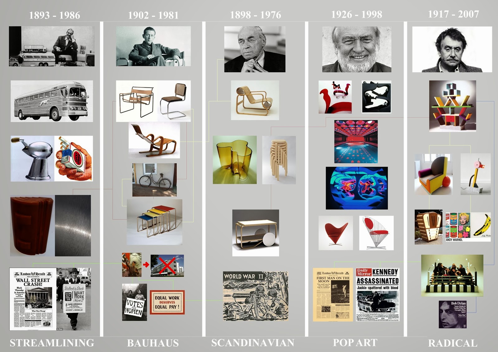
Task 2 Individual Work - Visual Chart


To Create my Visual Chart I chose to use Adobe Photoshop.

Notes on Visual chart:
The yellow lines show influences the designers and movements had, for example Marcel was influenced by Alto and his bicycle influenced him on his designs. Sottsass was influenced by pop art with its beautiful bright colours, also Art Deco shapes.

Red lines show the same material other movements used. Streamlining and Bauhaus used metal and Alto and Sottsass both used wood.

Green lines show what was happening through those years of the design movement. Scandinavian, streamlining and Bauhaus all had something to do with the Nazi and with people losing their jobs, without money and no place to live. During Bauhaus Women fought for their rights, to vote and to get equal pay why would a person working the same hours as others are and not want to have the same pay? World War 2 effected both Bauhaus and Scandinavian design. Both pop art and radical design experienced two memorable event which both effected them in design. The grand idea JFK had brought up and said that america will be able to put the first man on the moon and also later on they experienced a sad moments when he was shot dead in front of a big crowd in a roofless car with his wife.

Blue lines show the group of Memphis the song were they got the name from, while at Sottsass talking about the ideas he had for this group and a design the Memphis group design together.

I'm happy with how my Chart came out in the end, it's exactly what I wanted, no crowding, everything nicely put and certainly not confusing to realise what's happening between the movements, the designers and through the years of their designing on which influences they had and on why or what the had to design for,


Monday, 13 January 2014

Philippe Starck

Philippe Starck has said that he can design a chair in two minutes and a hotel in a day and a half. He prefers to work alone, sometimes “naked in the bedroom,” the Frenchman has invented thousands of products, interiors, and buildings for clients ranging from Microsoft to Baccarat.

In the begining he stopped studying architecture to work for fashion designer Pierre Cardin. In the Beginning of the 80s he achieved wide publis approval by designing furniture for president Mitterrand's private suite. in the Elysee Palace. He designed furniture for furniture companies such as DRIADE and a set of shelves for the company Disform. His designs show strong bio morphism - A surrealist art movement of the twentieth century that focuses on the power of natural life and uses organic shapes, with shapeless and vaguely spherical hints of the forms of biology, which influenced a lot of designers in the late 80s.

Philippe claims that he can design chairs in less then 15 minutes, which means that obviously he is supported by a strong back up team. He designed toothbrushes, pasta and a lemon squeezer which is quite famous and was in the homes of the early 90s chic.

The Lemon squeezer was quite an interesting design, also unique and how he came up with the idea is way more interesting. He was having lunch and ordered calamari and noticed that he didn't have a lemon so he asked the waiter for one. While squeezing the lemon Starcks came up with this grand idea-design and started drawing it on a napkin which he had infront of him.


Today the napkin is held in a museum and the squeezer made a great hit. He designer this for Alessi and this was not only his famous design but another which I do like is the Ghost chair. I couldn't help but realise while walking in Victoria Gozo to go have some coffee that a Cafeteria - Kozmo has Starck's look alike chairs inside and out and so I went to try them out I was so tempted that I had to see if they were comfortable. Here are the pictures below.

First Design of the Ghost chair:


The chairs I found at the cafe:


His first design was clear plastic but had no colour, these days they do them in any colour possible and they still do sell them or similar designs as you can see.


Fiell, C & P F, 1999. design of the 20th century. 2nd ed. china: ISBN.
Thames & Hudson, T&H, 2004. design since 1900. 2nd ed. singapore: C.C Graphics.

Design

Design for safety

Awareness which started in the 60s with the publication of the book:
“Unsafe at any speed: the designed- in dangers of the American auto mobile” by Ralph Nader 1965


The development of products making them safer to use.
The design of safety equipment such as:

  • Fire extinguishers
  • seat belts
  • air bags
  • smoke alarms.


These are manufactured according to guidelines and standards set by a specialized committee and there standards are included in legislations which govern product design and manufacture. In the toy industry products which comply with the European directives bear the mark CE this enables the products to be exported and imported in the member countries. 


Design for sport

Design for sport involves pushing materials and technologies to their limits. Sport equipment relies on research and development and designs are usually made with the latest computer technologies and in accordance with ergonomic data.
Designs to improve performance – helmets biker safety and etc
lightweight materials
carbon fiber  (helmets)


Design for the third world

The aim to empower developing nations to meet their own needs making economic and environmental sense.

Wobo (world bottle) 1960


Pedal powered washing machines
Motivation wheel chair design for landmine victims making used of locally available components
The hippo


The sierra portable light mat from portable light team. This has flexible solar cells from people around the world for people who don’t have power.


Design for children

Miniaturization
reduction of scale results in less weight
Less material
Cheaper to manufacture
Generates less waste


All notes were taking during class.

Sustainable Design

Sustainable design describes a design philosophy that values the natural environment as an integral factor in creating new products or modifying old ones.Sustainable designs try to maximize overall efficiency with surrounding resources, such as transportation such as well as energy efficiency, habitat preservation and restoration, natural and renewable energy sources, water conservation, recycled, local and non – toxic materials, and healthy and productive interiors.
Learning about green buildings; environmentally friendly and cradle-to- cradle design; when designing you’re already thinking of how it can be reborn again.

Planned obsolescence; how long the product is going to stay good and how much it will be used. It’s based on the concept of intentionally limiting the life of products so that the consumers are manipulated into consuming more.

The conflicting views:
1. Keeps workers/designers in employment and helps the economy
2. Waste is created by the premature replacement of the commodities

For example batteries, unless they are un rechargeable they’re useless. They’re also things you’d buy while knowing you’d be throwing it away for example Gillette razors and Make up refills instead of buying the whole products again.


Planned obsolescence can arise from:
1. Change in appearance/style: cookers from others and microwaves
2. Change in technology: from Samsung s4 to Samsung s5

Cradle to cradle:
It’s a method to minimize the environmental impact of products by employing sustainable production operation and disposable practice and aims to incorporate social responsibility into product development
Under the cradle to cradle philosophy products are evaluated for sustainability and efficiency in manufacturing processes material properties and toxicity as well as potential to reuse materials through recycling or composting.


Notes were taken in class.