Sunday, 29 December 2013

Anti design/Radical design

Anti design/Radical design was a movement which began in the 1960’s, it was led by Pop design. Its goals was to break the values of ‘good design’. Radical design praised individual creativity and expression and was also popularized by the Italians in the 60s and 70s. Designers thought that modernism was no longer avant-garde nor a cultural driving force since the industrialists changed it into a consumerist marketing venture. Their designs were also surrealistic and the pioneers of surrealist desgins were:

Carlo Mollino, Ardea armchair:


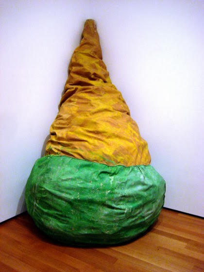
Claes Oldenburg, soft sculptures soft toilet and giant blt:


Gatti, Paolini and Teodoro, Sacco:


The first promoters of radical design were the design and architectural groups; Super Studio, Archizoom, UFO, Gruppo Sturm, Gruppo 9999, Cavart and Libidarch. They attacked ideas of what was ‘good taste’ and rebelled against happening and installations that questioned the strength of rationalism, advanced technology and consumerism. They turned everyday goods into an artistic level. An important spokesman for anti design was Ettore Sottsass. They’re designs were meant to be functional but not necessarily beautiful, their design were as quick to throw away and be replaced by something new and more functional. Anti-Designers wanted people to think about the objects they were buying, even if they ultimately threw those objects away. Designers used rich variety of colours, decorative elements, materials and created objects which were both useful but stood out for their bizarrely.

Piero Gilardi, Sassi-“the rocks.” Chairs made of polyurethane which were manufactured by Gufram. The form disguises the function and they’re imitating a natural object. A rock is hard and durable which makes these qualities totally at odds with the function of a chair, which is supposed to be soft and comfortable. So here we have Piero is defying Modernist functionalism.


The Joe Sofa was designed by Paolo Lomazzi and named after Joe Colombo, a legendary Italian designer. Its made of polyurethane, covered with leather and it was manufactured by Poltronova. Like postmodernist design, it’s an overblown symbol designed to communicate on a very basic level. It suggests that forms don’t have to be invented, they can just be recycled.


the art history archive. 2011. anti design. [ONLINE] Available at: http://www.arthistoryarchive.com/arthistory/antidesign/. [Accessed 29 December 13].
Fiell, C & P F, 1999. design of the 20th century. 2nd ed. china: ISBN.
Thames & Hudson, T&H, 2004. design since 1900. 2nd ed. singapore: C.C Graphics.


Friday, 27 December 2013

Pop Design


Pop Design was invented in the 1950's and by the word pop they meant popular design. It grew upon the affluence of the post war society in the 1950s and 60s. It started in the USA but also grew in England. People were bored with buildings and couldn’t be bothered to have more straight boring stuff/objects. The Independent group was formed in London 1952 and its members were; Richard Hamilton - an artist, Eduardo Paolozzi - a sculptor, Reyner Banham - an art critic and architects Peter and Alison Smithson, they were the first to explore and celebrate this movement in America.


In the 1960s ‘low art’ such as advertising, packaging, comics and television were inspiring artists such as Andy Warhol, Roy Litchtenstein and Claes Oldenburg. Pop design also began to show in design objects of everyday use. They came up with the saying “use it today sling it tomorrow”. They didn’t want to follow traditional norms and behavior they wanted something new unique and totally different. Designers mixed different eras with each other in design, it was a youth based design – rock peace and love.

Before pop design in the 1960s functionalism and good design were popular in Germany and Italy which then produced Bel (beautiful) design. Development of artificial materials such as polypropylene gave designers the possibility to experiment with design and colours. This is how plastics became very popular in design and it aimed at the youth market which was cheap, fun but without doubt poor quality.


Some designers were inspired by hippies, pop music, flower power and their own culture such as foods in diners.


Designs which were handmade and good such as Marcel Breuer’s and etc. were all looked at as inhuman, cold and outdated. Colour and ‘ephemerality’ were the new aspects of design. Pop design drew from many sources such as; art nouveau, art deco, futurism, surrealism, Op Art – blocks of colour Bridget Riley, eastern mysticism, kitsch and space age.


‘Less is more’ was no more something they believed in they did the total opposite which then led to Radical design. Designs were popular, transient, expendable, low-cost, mass produced, young, witty, sexy, gimmicky and glamorous. Designers also designed dresses out of paper which was called ‘throwaway fashion’, which truly began in the 20th century in Germany but then the idea was brought back to life in the 60s. In the hopeful, optimistic 60s, paper was the clothing "textile" of the future. At a time more and more goods were becoming "disposable" (plates, cups, cutlery, plastics in packaging, tissues, etc.), disposable clothing seemed like the next big thing.

20s:
 60s:


Till this day we still use things which were invented/designed during the pop design movement we still have Tupperware and it still is something most of us will find in our kitchen cupboards and we also are still inspired by Andy Warhol's work as you can see below.

Warhol's work:


Screenshots I took from a music video which reminded me of his work:


Wine packaging inspired by Warhol: 


Beginning of Tupperware to today's Tupperware, more variety of shapes and designs:

 Beginning:

 Today:


idealog. 2010. the die line. [ONLINE] Available at: http://www.idealog.co.nz/blog/2010/07/website-review-dieline. [Accessed 27 December 13].
v&a. 2012. paper dresses. [ONLINE] Available at: http://www.vam.ac.uk/users/node/6419. [Accessed 27 December 13].
mental_floss. 2009. Disposable Suits and Paper Underpants. [ONLINE] Available at: http://mentalfloss.com/article/21361/disposable-suits-and-paper-underpants. [Accessed 27 December 13].
creative glossary. 2011. pop art. [ONLINE] Available at: http://www.creativeglossary.com/art-stylesmovements/pop-art.html. [Accessed 27 December 13].
Fiell, C & P F, 1999. design of the 20th century. 2nd ed. china: ISBN.
Thames & Hudson, T&H, 2004. design since 1900. 2nd ed. singapore: C.C Graphics.


Thursday, 12 December 2013

Norman Bel Geddes


Norman Bel Geddes worked as a draughtsman in an advertising industry in Detroit and shortly afterwards he became an art director. He wrote plays, became a set designer and also designed lavish, luxurious, rich sets in New York. He was influenced by Frank Lloyd Wright with whom he had worked with too. Geddes then planned on designing architecture and product styling. He later on designed a book which showed his streamlining design and approach. 


This is a design Geddes drew/painted for a theatre set and in the picture below 
you can see how he developed it beautifully


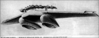
Geddes was one of the popular designers, he has a great impact on American life. during the streamlining movement he designed cars, ships and airlines. 


In the sketches above you can see that he was thinking of something new and which never existed it looked futuristic and streamlined at the same time because of it's smooth curves and tear drop shapes both of them have. He believed in the importance of the tear drop shape, as you can see in most of his designs. 


Though I have to admit that Geddes car design reminded my of a cartoon space ship - futurama. Just to realise the this has been design years ago and a cartoon of this era comes up with something similar.  He also designed metal bedroom furnishings for Simmons. One of his most noticeable kitchen designs was the Oriole stove.


The Oriole Stove is one of his most commonly used and supplied design. In the picture below you'll see furniture Geddes made from metall for Simmons.


In my opinion they didn't look streamlined thought the dresser on the left does have more of a nice curvier shape which makes it more interesting for its age.


Thames & Hudson, T&H, 2004. design since 1900. 2nd ed. singapore: C.C Graphics.


Monday, 9 December 2013

Walter Dorwin Teague


Walter Dorwin Teague was beside Raymond Loewy and Norman bel Geddes during the streamlining movement. He was an artist and worked in an advertising industry and had his own typographic office. Dorwin was also involved in packaging and began working for the industrial design in 1927. His first and most long lasting client was Kodak. In 1928 Kodak hired Walter Dorwin Teague to create cameras with a classier, more elegant look. His first creation was Series 3 Vest Pocket Vanity Kodak.


It was a metal and embossed leather camera that came in five colours: Bluebird (deep blue), Cockatoo (green), Sea Gull (gray), Redbreast (red), and Jenny Wren (brown). He also designed a camera for women to still look their best while taking photos which he named the ‘Vanity’ Kodak Ensemble outfit.


This design included a colour-coordinated camera, lipstick holder, compact, mirror and change purse in a fitted case. His most popular Kodak cameras of the twenties and thirties were designed for the entire family. Another famous camera which he designed was the Beau Brownie. The Beau Brownie was made in two sizes and came in five colours with a modern Deco two-tone pattern on the face and box.


 Teague also designed for Ford he wasn't that much of an auto mobile fan, he didn't actually design any cars himself. He was also hired to design new Pullman coaches for the new haven rail-road.


Today’s Apple designs are inspired by Teague’s idea. They saw how he made several different colours of the same product like the camera’s he designed with Kodak that were very successful, he wanted to expand the markets appeal in particular to women. Apple produced the player which was very successful but still wanted to expand the market so they looked back in the past found Teague’s camera designs and came up with the same grand idea.


brownie camera. 2013. walter dorwin teague. [ONLINE] Available at: http://www.browniecamera.nl/walter_dorwin_teague.htm. [Accessed 09 January 14].

kodak. 2013. gloriously colourful . [ONLINE] Available at: http://kodak.digitalfx.tv/#/cameras/beau-brownie. [Accessed 09 January 14].
bloomberg business week. 2008. what apple learned from kodak. [ONLINE] Available at: http://www.businessweek.com/innovate/next/archives/2008/12/what_apple_lear.html. [Accessed 09 January 14].
Fiell, C & P F, 1999. design of the 20th century. 2nd ed. china: ISBN.


The World of Tomorrow

Streamlining

Streamlining is a word which is similar to the word styling. It reflected the magic of speed hydrodynamics; the dynamics of fluid in motion, and aerodynamics; The dynamics of bodies moving relative to gases, especially the interaction of moving objects with the atmosphere and tear drop shaped designs.


It was popular in the 1930s - 1950s. Streamlining designs were characteristically of one sleek, seamless body. It suggested speed and glamour, which entered American design in the post-Depression years. It was widely applied in new forms of architecture, interior decoration and everyday household goods for the home and office. Due to the war people were depressed and the president promised progress, economic recovery and the hope of the future as the Great Depression held the world in its grip, he wanted the people to have a better, brighter, sleek, futuristic new look for New York.  Therefore he asked Raymond Lowey to help him out with “the world of tomorrow”. Other designers of streamlining were Norman Del Geddes, Henry Dreyfuss and Walter Dorwin Teague.


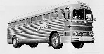
Raymond Loewy was the most famous designing during the streamlining years. He designed everything from coca cola bottles, logos, home ware, cars, buses, planes and even a shuttle for NASA space stations. At first he was an illustrator who worked for vogue and other fashion magazines. He used to make models out of clay which had smooth sleek forms which were then used for his final designs. His streamlining designs made transportation look more appealing and modern. It also improved performance and efficiency. Loewy didn’t allow form to be dedicated by function but he merged the two together and paid attentions to the aesthetical qualities of the product.


As you can see in the pictures above the streamlining design did not have any sharp angles it had that curvy, bubble, smooth effect/form or shape.


tasha does tulsa. 2011. merican-streamlined-design-philbrook. [ONLINE] Available at: http://www.tashadoestulsa.com/2011/02/american-streamlined-design-philbrook-museum/. [Accessed 27 January 14].
Fiell, C & P F, 1999. design of the 20th century. 2nd ed. china: ISBN.
Thames & Hudson, T&H, 2004. design since 1900. 2nd ed. singapore: C.C Graphics.

Sunday, 8 December 2013

Ray and Charles Eames


Ray and Charles Eames were among the most important designers of the 21st century. They were the first to design and mass produce moulded plywood furniture with fibreglass-reinforced plastic, bent metal wire and aluminium. He was an architect by training, she was a painter and sculptor, together they are considered America’s most important and influential designers. In the 40s Charles worked with Eero Saarinen, with whom he started to investigate the artistic possibilities of the new mid-20th century materials like plastic, which enabled die-press stamping of seats.

Chair Shell Experiments, designed 1941-45, moulded plywood, metal, and rubber.


 Their work came to the attention of the military in World War 2 and they were asked to design moulded plywood splints, stretchers and aeroplane parts. They continued their work in furniture design after the war. 
Lounge chair the chase 1968.


Eames Splints for military

Eames Strechers


The Eames house had modern and classic architecture; it was decorated with an eclectic and colourful mix of toys, kites and eastern wares. They also wrote books and designed museum exhibitions, made films, designed toys and etc.


The elephant toy designed my the Ray and Charles Eames is still in production till this day.


Their moulded plywood chair was called “the chair of the century” by the influential architectural critic Esther McCoy. Later on Herman Miller took over the production of this chair and still continues to do so till this day. He also changed the chair’s design but not all of it he just 'played'around with it to make it more wanted, for people to continue buying.


Eames design of the  chair


The small differences Herman Miller did to the chair design. He added a softer base for sitting and he also did other designs with tubular metal legs to give a nice new contemporary look to them.


A World of Design. 2013. the eames team. [ONLINE] Available at: http://andrewflynndesign.wordpress.com/2013/03/02/the-eames-team/. [Accessed 08 December 13].
eames office.com. 2013. charles and ray. [ONLINE] Available at: http://eamesoffice.com/charles-and-ray/. [Accessed 08 December 13].
eames designs. 2013. a A BRIEF VIDEO INTRODUCTION TO CHARLES AND RAY EAMES. [ONLINE] Available at: http://eamesdesigns.com/about/charles-and-ray/. [Accessed 08 December 13].
smart furniture. 2013. Eames Molded Plywood Chair: Design Story. [ONLINE] Available at: http://www.smartfurniture.com/hermanmiller/eames_plywood_chairs/designstory.html#.. [Accessed 08 December 13].
modern kiddo. 2011. Mid Century For This Century :: Eames Elephant.. [ONLINE] Available at: http://modernkiddo.com/mid-century-for-this-century-eames-elephant/. [Accessed 08 December 13].
moon to moon. 2012. eames house. [ONLINE] Available at: http://frommoontomoon.blogspot.com/2012/03/eames-house.html. [Accessed 08 December 13].